T-MOBILE BUSINESS INTELLIGENCE APP
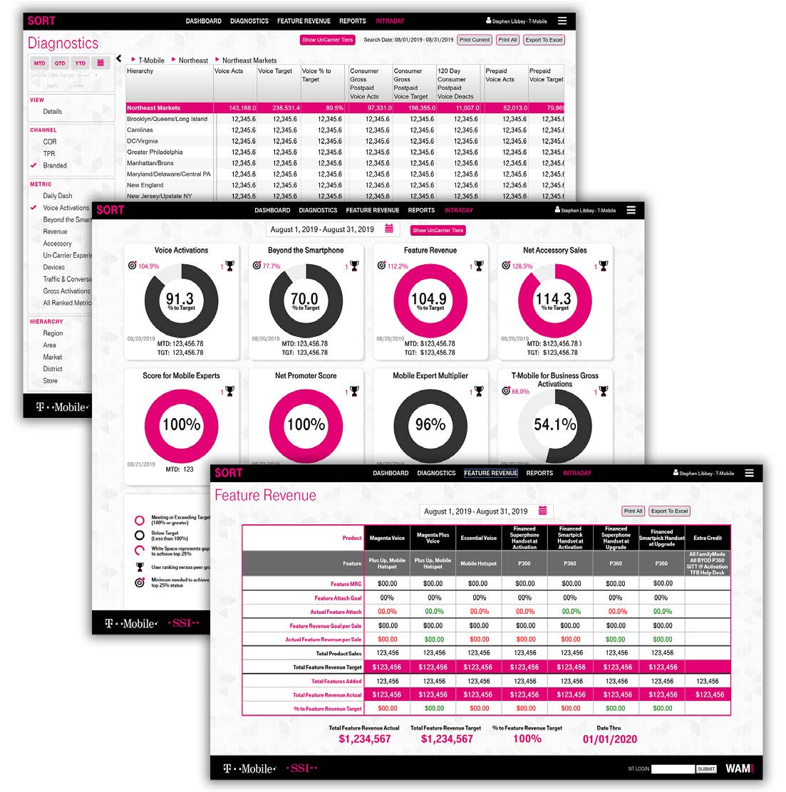
In 2016, T-Mobile faced a challenge: their existing business intelligence solution, Tableau, was not only expensive but also lacked the flexibility to meet the particular needs of their thousands of store managers and executives. They needed a more cost-effective and tailored solution that would empower data-driven decision-making using their unique metrics across the organization.
Approach
They brought our five person team onboard to design and develop a custom business intelligence application, which we dubbed SORT, that would replace Tableau and Power BI, plus provide T-Mobile with the sales reporting they needed to sustain their unique business strategy. We based our approach in MVC, user-centric design and agile development.
Discovery & Research
We collaborated closely with T-Mobile leadership to understand their pain points, requirements, and vision for the future. Foremost, were the custom reports they commissioned from the senior data analyst; it took him three days to write the necessary SQL queries. These formed the foundation of our BI engine. Speaking with store managers, our largest user base, we learned about their boots-on-the-ground BI usage. I dove deep into Tableau and Power BI to identify the limitations our departments encountered.
Ideation
I created wireframes, mockups, and prototypes to visualize the user experience with the stakeholders, who found this process helped tease out nuances in their needs that Tableau could not accommodate. We spent extra effort to create an admin section for super users to update the SQL queries through an easy UI.
Design
T-Mobile’s strict internal brand guidelines were incorporated to be sure that the interface was intuitive, engaging, while still leveraging best practice data visualization techniques; i.e. I had to make a case for incorporating a data color palette that wasn’t all magenta!
Data Visualization
I worked closely with our data analysts to design custom graphs that could display multiple metrics. This was one of the features that T-Mobile could not replicate in Tableau or Power BI.
Development & Implementation
We decided on a tech stack of Angular, .NET, and C# to build a robust and scalable MVC application. We optimized performance with multidimensional cubes and ensured seamless integration with T-Mobile’s existing data infrastructure… then did it again when Sprint was acquired, and yet again when everything migrated to Azure.
Agile & Iterative
We championed an Agile Scrum methodology, working in sprints and incorporating stakeholder feedback throughout the development process. This allowed us to adapt to changing requirements and ensure that the final product met T-Mobile’s evolving needs. Our department then modeled their adoption of Agile on our methods.
Solution
The result was a custom business intelligence application that not only replaced Tableau but also exceeded T-Mobile’s expectations:
Cost Savings:By eliminating the need for Tableau subscriptions, T-Mobile saved millions of dollars annually.
User-Centric Design: The intuitive interface and powerful data visualization capabilities empowered leadership and store managers to easily access, analyze, and share critical sales data, down to individual employee performance.
Predictive Insights: The application went beyond reporting historical data, providing predictive insights that enabled T-Mobile to anticipate market trends and make proactive decisions.
Scalability: The platform we built (which we nicknamed “WAM2600” after the Atari 2600 video game system, with its cartridges representing different data visualization modules) was designed for future growth, allowing T-Mobile to easily develop and deploy additional internal applications across various departments.
Impact
The custom business intelligence application had a profound impact on T-Mobile’s operations:
Empowered Decision-Making: Store managers and executives across the organization were equipped with the information they needed to make informed, data-driven decisions.
Improved Efficiency: The streamlined workflows and intuitive interface saved users time and increased productivity.
Competitive Advantage: The predictive insights enabled T-Mobile to stay ahead of the competition and improve their market leadership position, to the point that they exceeded, then acquired, Sprint.
Conclusion
This multiyear role proved to be one of my most successful and eye-opening. I had little data visualization experience before the project; at the end, business intelligence, sales data, and multi-metric graphs filled my head. The flat structure of T-Mobile made discovery so effective that our difficult goal of exceeding the utility of Tableau was achieved – a true team effort that spanned the entire department and thousands of store managers. Everyone brought their best ideas, enthusiasm, and support to the project. There’s a reason T-Mobile kept winning the JD Power award for best workplace, and I attribute the success of SORT to that spirit. I still keep in touch with my old teammates.


T-MOBILE
COACHING & PERFORMANCE APPLICATION
Design + Data Visualization/Interactivity
2017
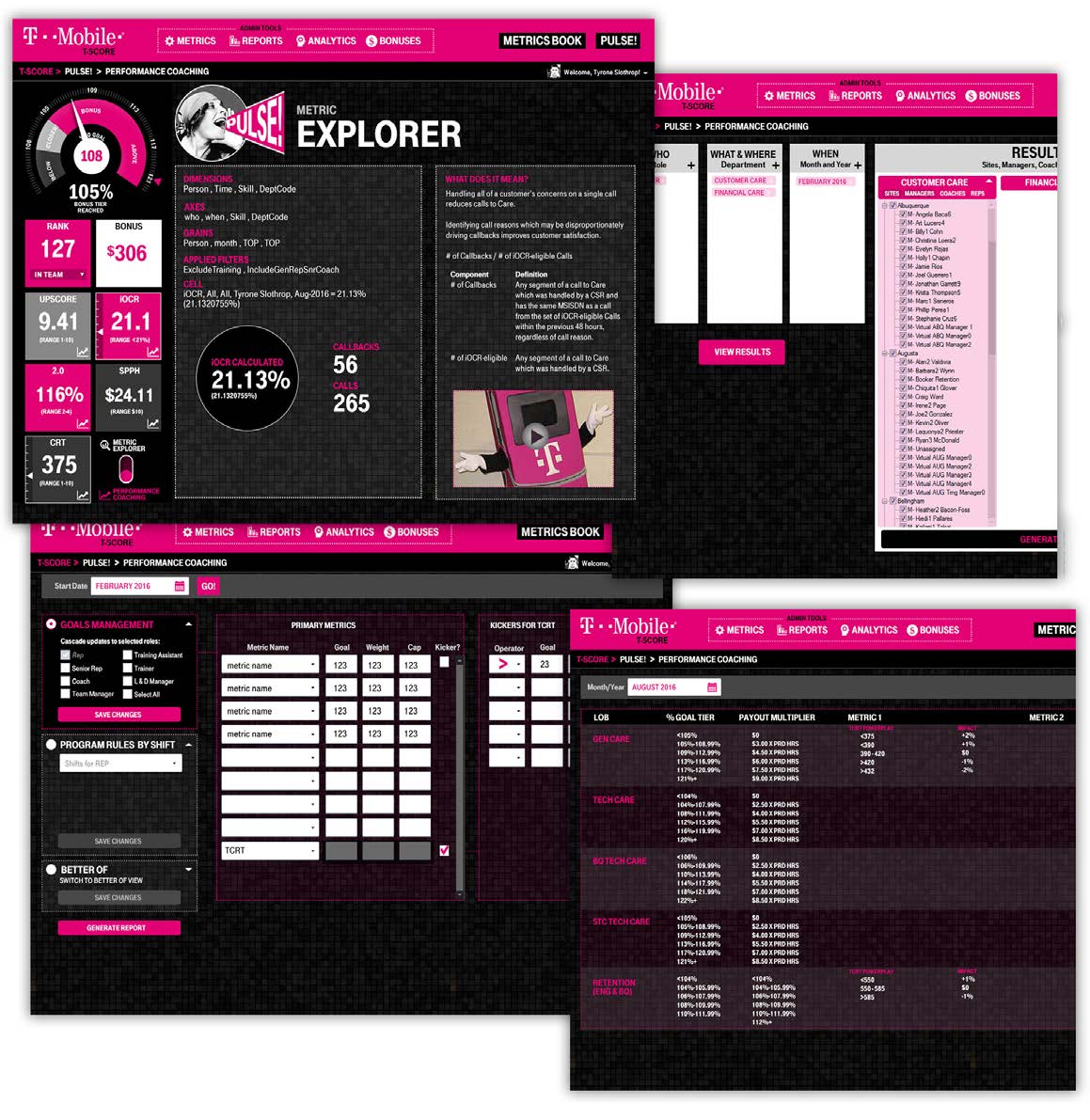
At T-Mobile, the Care team’s energy and enthusiasm are legendary, a large part of why T-Mobile became so successful. When they asked me to redesign their call center performance tracking application, the challenge was clear: maintain that vibrant spirit while delivering an intuitive, fun tool that empowered employees to track their progress and maximize their bonuses, while navigating through some complex metrics. This wasn’t just about numbers; it was about creating an experience that reflected the call center’s upbeat culture.
Collaborating with a Java developer, we explored innovative ways to visualize performance data. Dynamic tiles, like the eye-catching gauge in iOCR, transformed dry statistics into engaging, interactive elements. Employees could now see their progress at a glance, understand what actions would boost their bonuses, and – most importantly – feel motivated to achieve their goals.
The redesigned application wasn’t just a hit with the call center staff; it also provided management and leadership with valuable aggregated insights, organized by location. By blending data visualization with the call center’s signature enthusiasm, we delivered a tool that supported both individual success and overall team performance.
T-MOBILE
INTERNAL SCRUM TEAM LOGOS
GRAPHIC DESIGN
2018
T-Mobile cultivates a fun, energetic company culture, fully willing to embrace nerddom as the circumstances demanded. My Web and Mobile team was the guinea pig for Agile Scrum methodology; taking our lead, the department reorganized on a lean agile framework.
The new teams were allowed to name themselves anything they wanted. For reasons best left mysterious, Voltron was the predominant theme of the day.
I was asked if I’d be willing to block out time to design some scrum team logos, which is exactly the kind of break from coding that I relish. These designs were built in Photoshop and Illustrator at high resolution for signage and apparel. I also told them they were a bunch of nerds. Team Q-Bert’s logo is my favorite.
(Screenshots used with permission)
MIKE & MIKE’S GUITAR BAR
SHOPIFY ECOMMERCE
Product Design, Shopify Implementation
2019-2024
Our favorite neighborhood in Seattle is Fremont, and Mike & Mike’s Guitar Bar, a top rated vintage guitar shop, was one of the reasons. On Saturday mornings, my dog and I would stroll over to bask in the showroom full of beautiful old guitars — mostly out of my price range, and some suitable for a guitar museum, all inspiring to me as a guitarist. When Mike Ball needed to replace his sunsetted Reverb.com e-commerce store in a hurry, I offered to step in with a modern Shopify upgrade.
What I didn’t count on was the enormity of the Mikes’ stock, the wealth of professional quality pictures of the guitars, and the long-form, elegant guitar descriptions that belonged in a book, and delightful blog posts of equal quality. Covid had arrived, so Mike would depend on the site for 100% of his sales of guitars that could fetch up to $100,000. Their market was quite different than Guitar Center’s.
We settled on a clean theme, optimized for responsive and focused on the photography, with a mid-century modern/golden age of guitar manufacturing vibe. Guitarists will gaze upon guitar photos for hours, so I leveraged that interest to extend user visit times. The exported product data needed a lot of massaging to enable a bulk upload. I also incorporated the blog posts and media that they had created.
The Guitar Bar transitioned to the Shopify site with no hiccups, and were able to stay in business through the dangerous early years of the pandemic. Buoyed by that success, they expanded their showroom to two floors in preparation for the return of foot traffic. Today they are one of Seattle’s top guitar stores, though I still can’t afford a mint condition 1958 Gibson ES-335 without a home equity loan. Maybe some day!

NORAD TRACKS SANTA
HOLIDAY MULTIMEDIA SITE
UI/UX/ development
2014
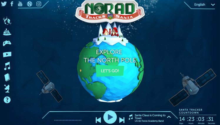
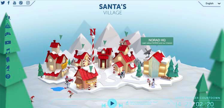
Who is Santa? Is he a foreign agent or merely a friendly ally who comes bearing gifts once a year while violating US airspace? Well, NORAD needs to know, so they instituted a Santa Tracker in the 50s to provide realtime updates to kids everywhere about Santa’s flight path. This project was a collaboration between NORAD and Microsoft, so I worked on it twice (2013 and 2014) as part of iLink Systems. We were responsible for the buildout of the site, using illustrations, music and games from other contributing partners.
In 2013 I worked on the content pages while the lead programmer wrote deliberately indecipherable javascript to power the rest of the site; no one could read his code, so the site went live with bugs. He was subsequently fired, leaving the company in the lurch for next year’s deployment.
Late in the game in 2014, they brought me on to finish the job. I threw out last year’s code and rebuilt the site from scratch using well-supported and reliable libraries like Bootstrap, Jquery, and Greensock JS (for animation). The result was an optimized, smoothly running site with full responsive capabilities (because who knows what hand-me-down device a kid will be using). They were able to use the codebase for future versions, saving weeks of development time.
Fun story: NORAD Tracks Santa was born in 1953 when a newspaper ad was published urging kids to call Sears to talk to Santa… but the number was misprinted, instead connecting them to NORAD’s monitoring center, where a kindly Colonel realized the mistake and pretended to be tracking Santa. Thus a tradition was born. In NPR’s reporting for 2014, their article about the site launch ran the headline “NORAD Tracks Santa Begins with a Typo.” I nearly had a heart attack.
NOAA PCSRF
PACIFIC COASTAL SALMON CONSERVATION PROJECT TRACKER
Design + templates
2012
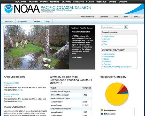
This government app provided tracking information for salmon recovery projects conducted by NOAA in cooperation with scientists, conservation organizations, rangers, and native tribal councils.
Written in HTML/CSS, it tied into an Oracle database using APEX. The output of database queries arrived as a massive table of scientific data. I designed the app to resemble a familiar looking, intuitive webpage that nevertheless gave access to all the scientific data for those users who wanted to see it (scientists), but otherwise summarized the information in graphics and charts for less sophisticated users (students and policymakers).
Many salmon were saved (only to be eaten later).
I also designed an app for assisting commercial fisherman with trading their hauls while adhering to fishing regulations. Very interesting to learn how difficult that business can be.
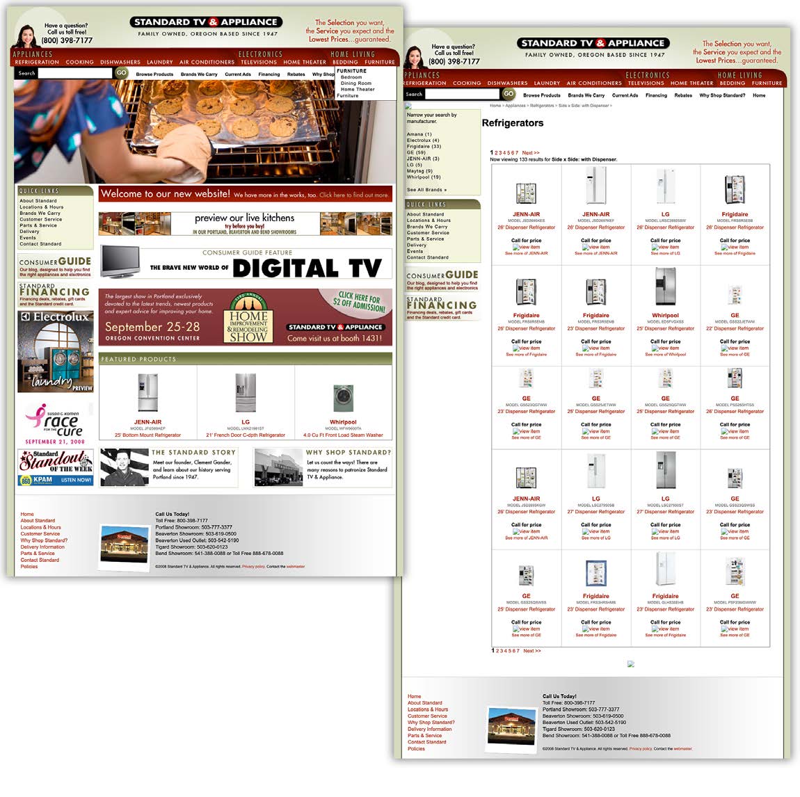
STANDARD TV & APPLIANCE
ENTERPRISE ECOMMERCE & PRODUCT MANAGEMENT
Product Management & Design
2009
Portland’s oldest appliance retail chain, Standard wanted to get the edge on their big box competition. Their business model retained the best qualities of old fashioned, customer oriented retailing: highly trained salespeople who could help the buyer navigate the myriad options and considerations involved in an expensive home appliance purchase.
They didn’t want to lose that focus when they took their products online. I was contracted to spend a year overseeing the construction of an eCommerce shop on par with Home Depot and Sears.
After weeks of research, I generated a detailed RFP and vetted the vendors who responded with proposals. The vendor who won my heart, Copious Creative, built a Ruby on Rails eCommerce app to my specifications, with particular emphasis on reining in a scattered inventory stored in an ancient legacy management system.
In addition to managing the product data, I provided design direction, concepts and branding. Several of my unique features, such as the wish list, filtered search, enhanced product details, and hand-picked product experts, brought the customer and sales staff together in an online exchange even before meeting in the brick and mortar store.
The store launched in June 2009 and immediately made a 22% improvement on sales and customer traffic (web and instore) in the following quarter.
